Not-A-Fire
After spending too much time staring at the roller coaster of a stock market during and shortly after the pandemic crash, I decided to do a deep dive into SwiftUI by creating a stock portfolio desktop application. The app became my goto over Apple’s pre-installed Stock.app, mainly because I could better track and analyze my portfolio gains/losses. Of course, I could easily log into my brokers website, but a native app was much quicker and easier. I’m still not in the camp that thinks everything should be on the web.
I had originally thought I was going to write a notification app that could notify me of swings in stock prices, but it turned into what it is, instead. Notifications may still be added in the future, but for now it’s just in the name “Not-a-Fire”. A weak pun; I know.
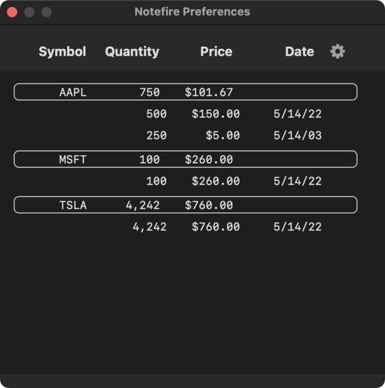
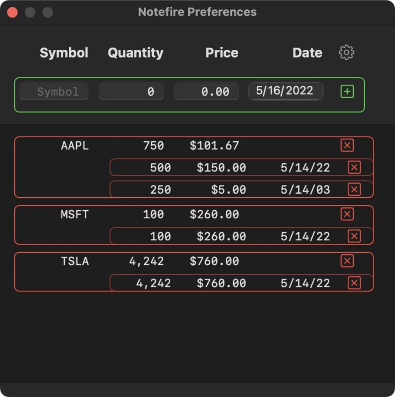
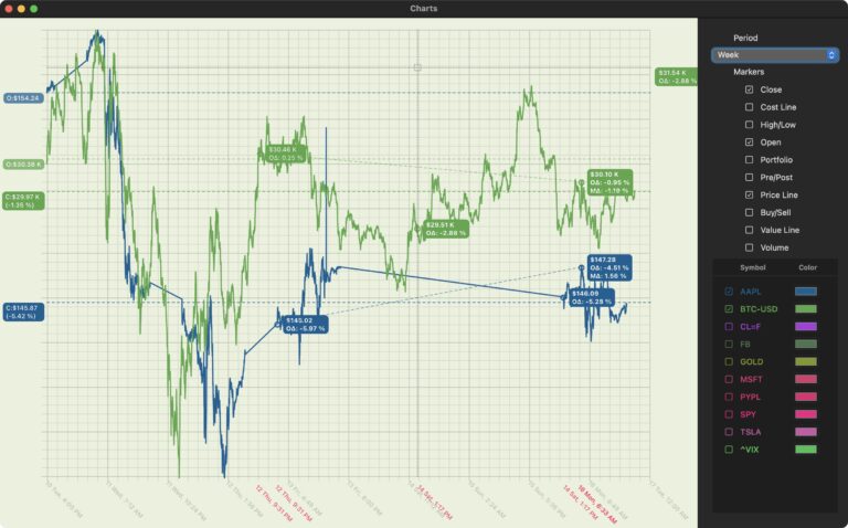
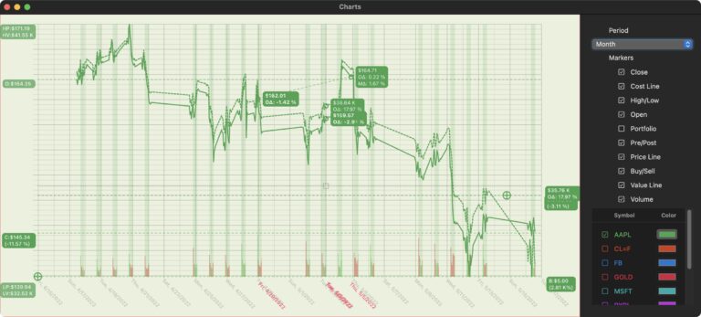
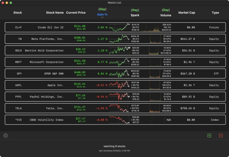
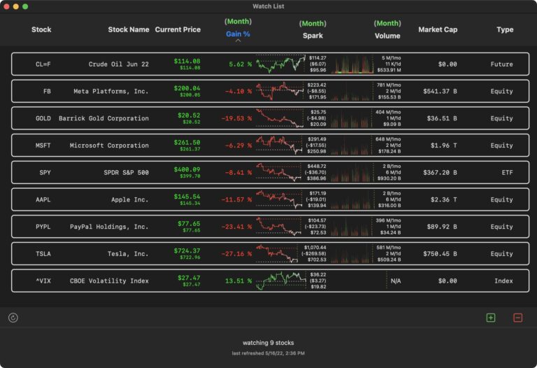
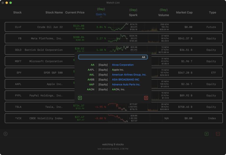
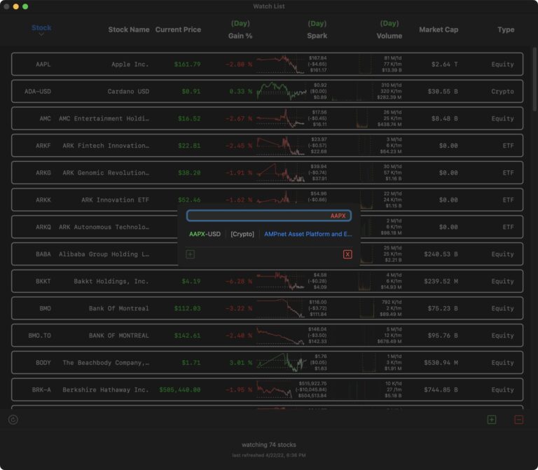
The screenshots below showcase a few features of the UI, which is entirely written in SwiftUI. This is an app that I am constantly adding features to as my mind wanders. Because of this, the UI is in constant flux. For me, I find it important to have at least one project where the rules are lax enough to let the creativity have its full bandwidth.
Update (2022-11-29): I was excited to try out the new Charts API that was released with MacOS Ventura (13). I was able to get the majority of the functionality I built into my own charts with much less code (essentially all the code was hidden within the API), but the performance degradation was definitely not feasible. I don’t think the API is built to display both large amounts of data points, nor multiple graphs with a large number of data points in the same chart. It doesn’t seem like you can group draw calls in a performant way. Anecdotally, I heard that you should bin your data to handle large numbers of points. This was insufficient for my use case. I think all the spikes and outliers are important in these graphs and binning would just smooth the data. Let’s wait and see how the API evolves and what solutions others may find.


